The visuals have changed. The vision hasn’t.

The visuals have changed. The vision hasn’t.

Door Connects, Wall Separates.

At Tammer, everything starts with a door — and so does our story.

For 30 years, we’ve been designing and manufacturing high-quality metal doors that help create safe and practical spaces for everyday use. We build with care, experience and purpose, always keeping sustainability in mind.

Now, it’s time our visual identity reflects that same clarity and ambition.

Historically, we’ve been modest with visual change. But growth, innovation, and our evolving sustainability goals have brought us to a point where standing out clearly with a distinct and meaningful brand is essential.

We rethought how we present ourselves to make sure it reflects both who we are and the trust others have placed in us. You’ll see shapes inspired by door frames. A typeface shaped like bent metal. Violet — a colour that blends tradition with bold ambition — adds a meaningful accent to our visual language. Each detail has been carefully chosen to tell a story of trust, quality, adaptability, and innovation.

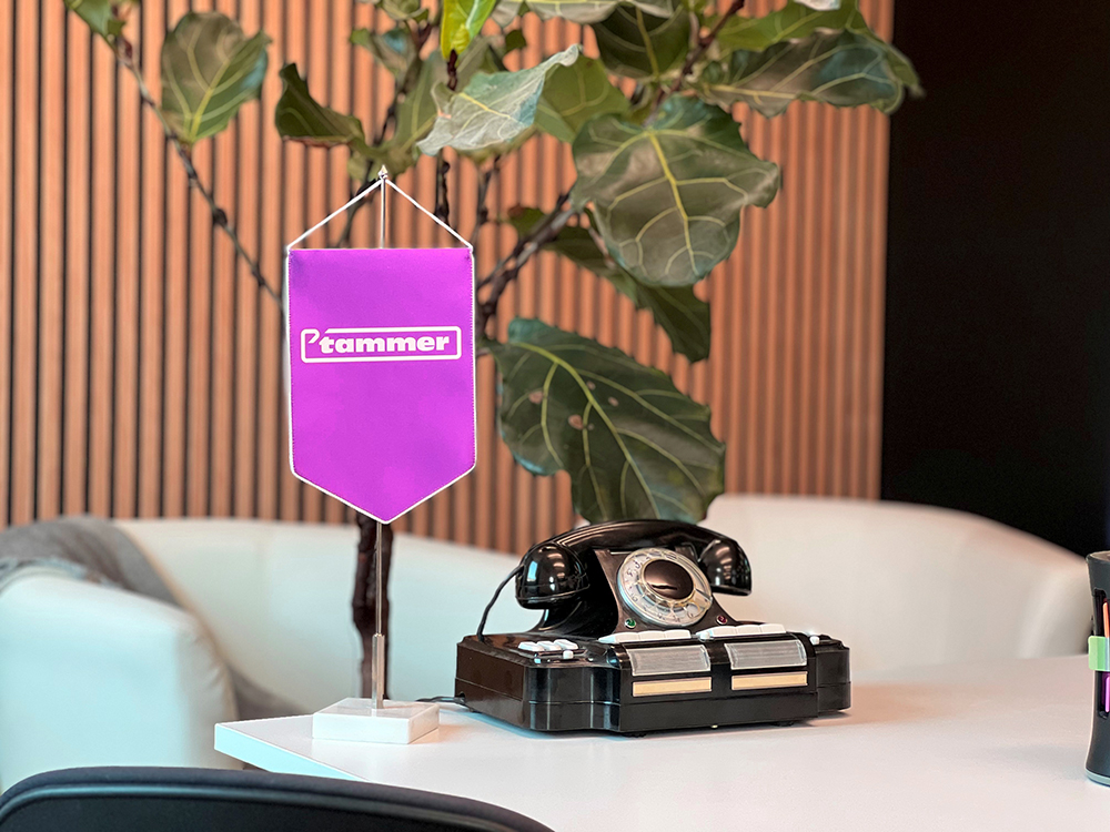
Design is only part of it. What matters more is that our brand feels right — aligned with how we think, build, and move forward.

We’re taking a gradual approach to implementation. That means you may still see some of our red service vehicles or older visuals out in the world for some time. We’re not replacing things for the sake of change. We’re doing it with care and intention, keeping what still serves us, and step by step replacing what no longer does.

Crossing this new threshold, we carry forward the same values that have guided us for over three decades.

If you’d like to see more, the full visual transformation is just below.

The new visual identity was created in collaboration with Velvet Design Agency.

Website development by vDisain.


Give us feedback